I’ve really been enjoying the new Microsoft Duo phone that I picked up last weekend, after my Pixel 3XL decided to become an air hazard mid-flight to Tampa. I really like the form factor, and it seems to be a solid performer, even if the ergonomics of the camera could use a revision in the next version of the device. (Bite the bullet and put a camera bump on the exterior, Microsoft!)
As I stated in my prior note, the device feels like walking around with a paperback in my pocket all the time. So, with that as an inspiration, I decided to try and make it look like a paperback book in lieu of a traditional case - one that doesn’t seem to exist, given the challenges of the device’s 360°hinge setup. So the approach that I took this time was to commission some vinyl “stickers” to cover the surface and to switch from white rubber bumpers to the darkest gray that I could buy from Microsoft. (There were not a lot of choices there.) I decided early-on that since a regular protective cover wasn’t available, I’d keep the rubber bumpers on for any additional protection that they might offer.
Initially, I thought it would be cool to see if I could find some high-resolution scans or custom interpretations of the paperback covers of one Sutter Cane, John Carpenter’s Stephen King character from “In the Mouth of Madness”:
I discovered that these covers did exist, but I ran into two problems:
Finding the actual high-resolution images suitable for printing was problematic. The files exist, but the folks that have them are not sharing them online, opting instead to create and sell Sutter Cane memoriabilia online.
Despite the Surface Duo feeling like a paperback, the actual aspect ratio of the two sides (one with bumper covering the edge of the surface, one without) are quite a bit different than the aspect ratio of paperback books, and I was unable to find a satisfying alignment that looked acceptable.
So, with those issues in mind, I defaulted back to my original plan of using pulp magazine covers instead. While those covers didn’t line up perfectly as well, I was able to do some Photoshop magic with the Context-Aware Fill tool to extend the dimensions of the covers in a way that looked like the original artwork.
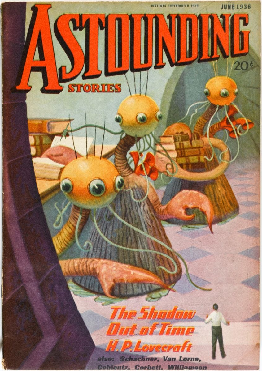
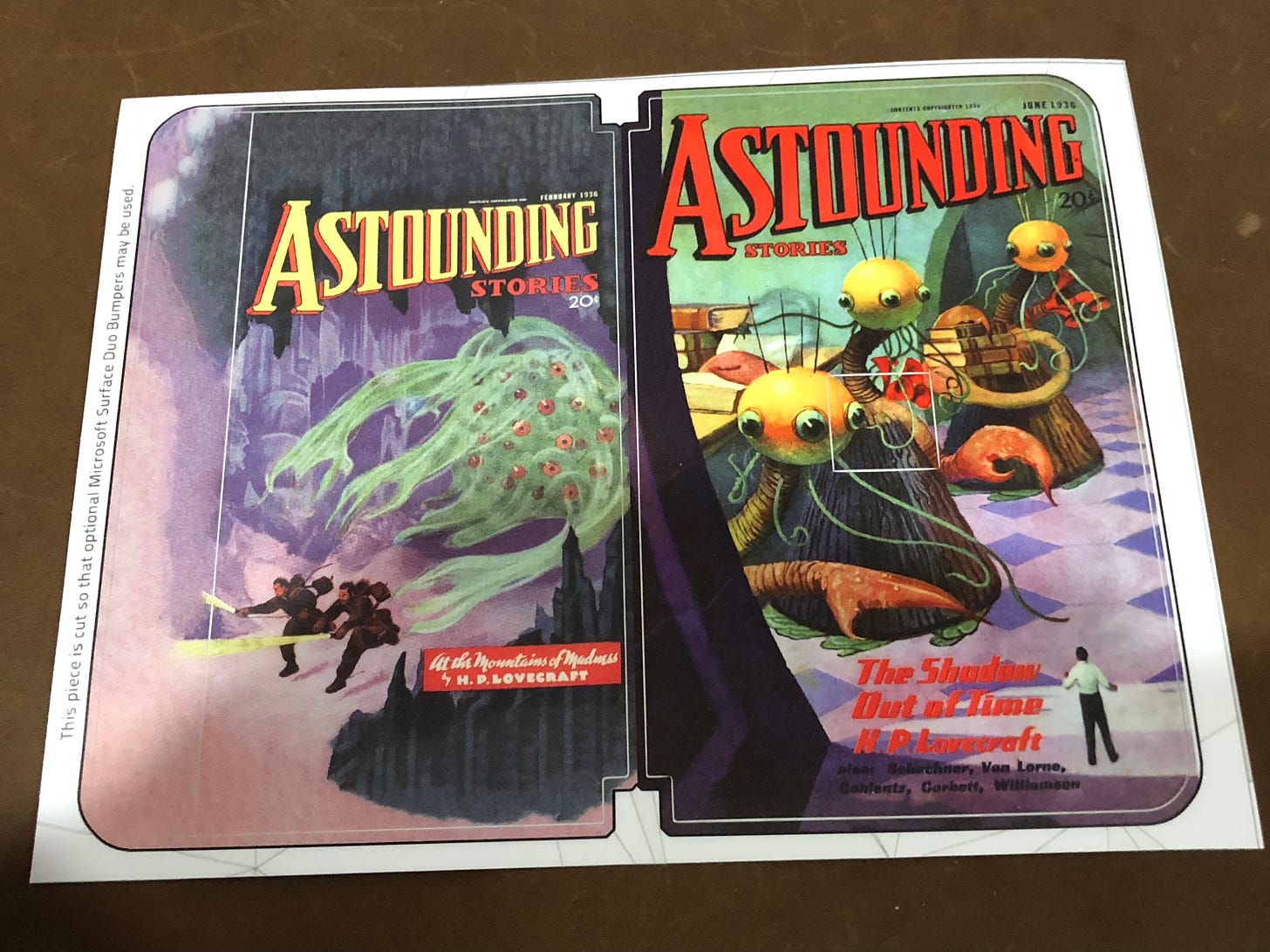
After some experimentation, I chose June 1936 cover of Astounding Stories, which featured Lovecraft’s The Shadow Out of Time:
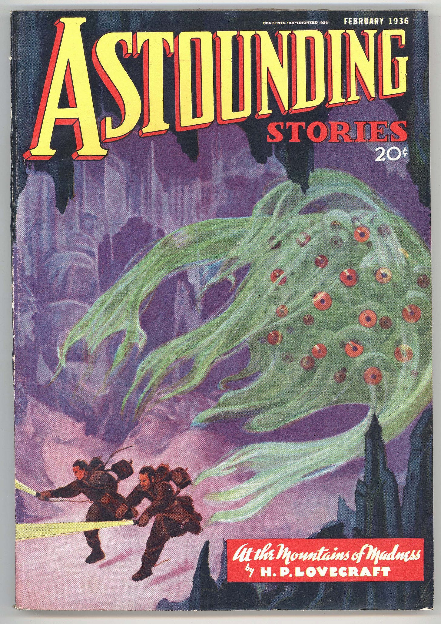
And for the back side (with the bumper), I chose another issue from earlier that year that introduced the world to At the Mountains of Madness:
To be able to get the proper aspect ratios, I extended the covers in each direction so that I could position the main rectangle of the cover as needed within the print boundaries.
I commissioned the covers from DecalGirl, which seems to be a business that focuses on these kinds of decals for laptops, phones, and game consoles. From Microsoft, I purchased a gray bumper and this morning, I had all the pieces I needed to get started.
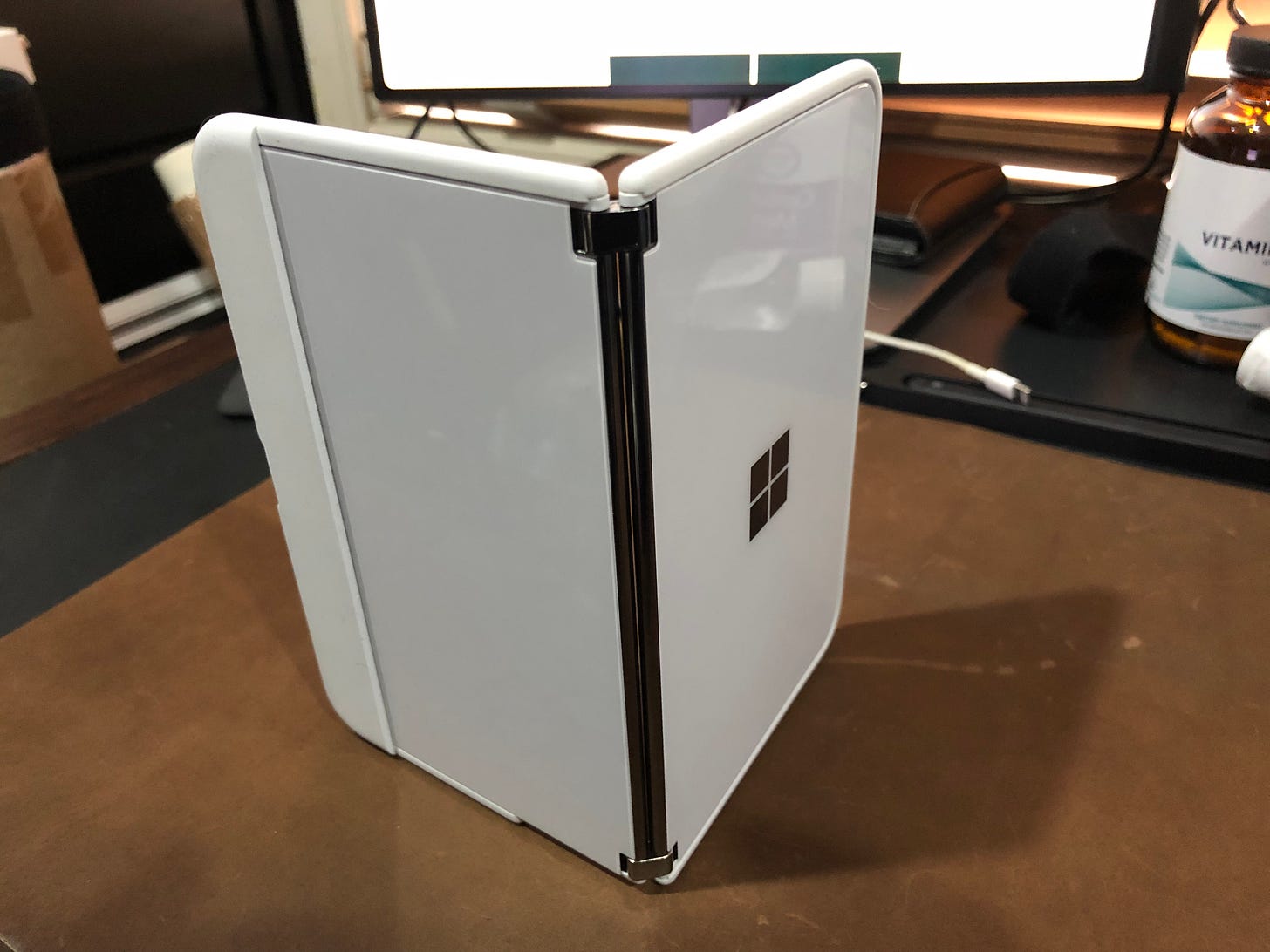
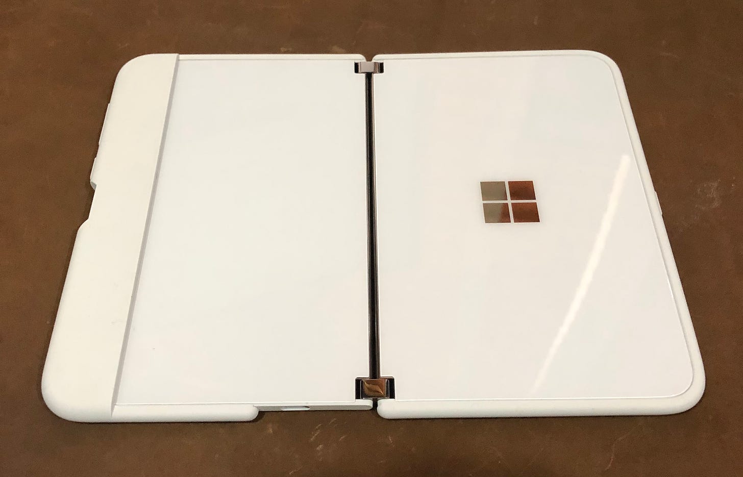
Heres’s what the device looked like pre-transformation:
It’s a decent, if boring look.
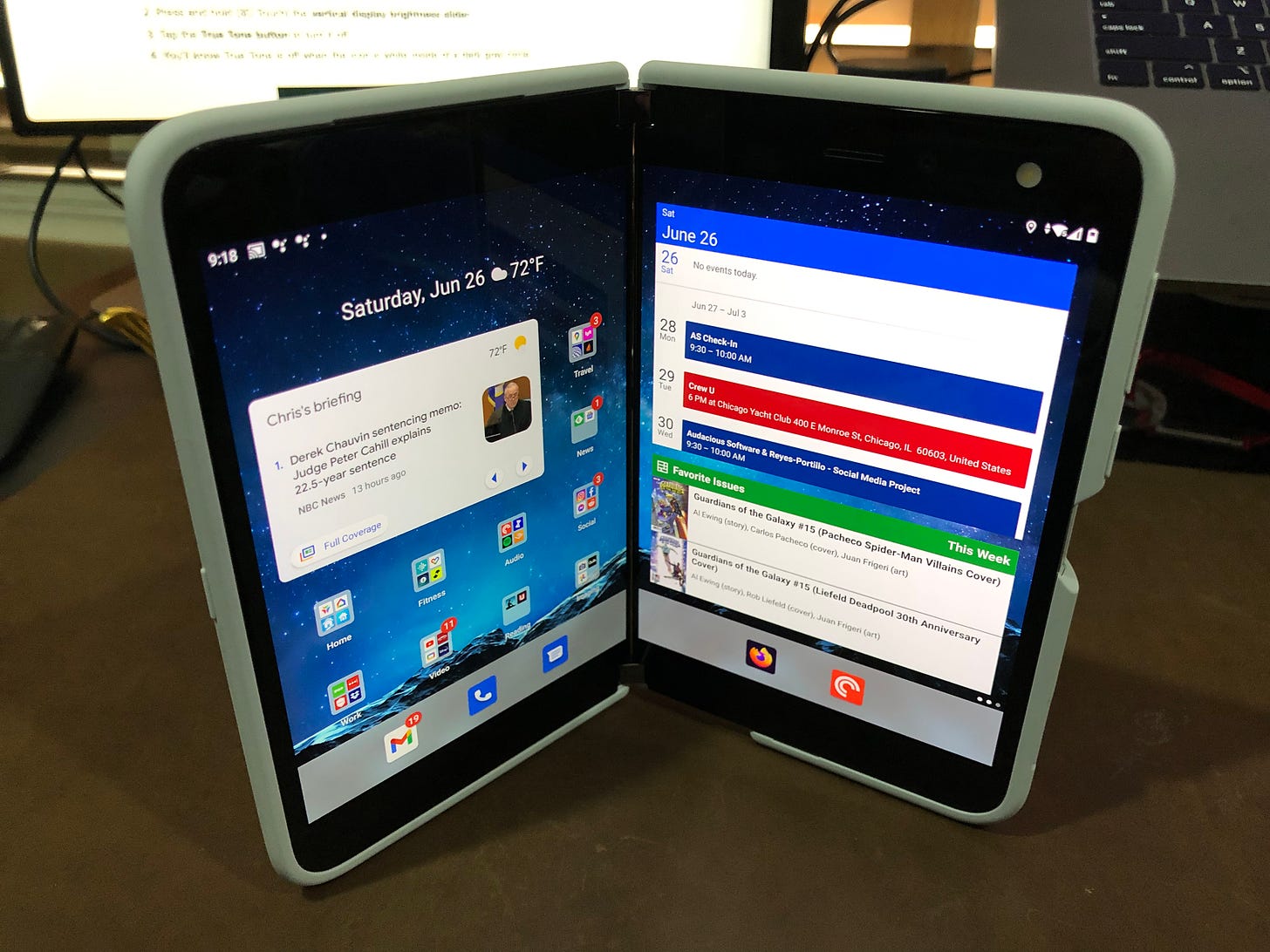
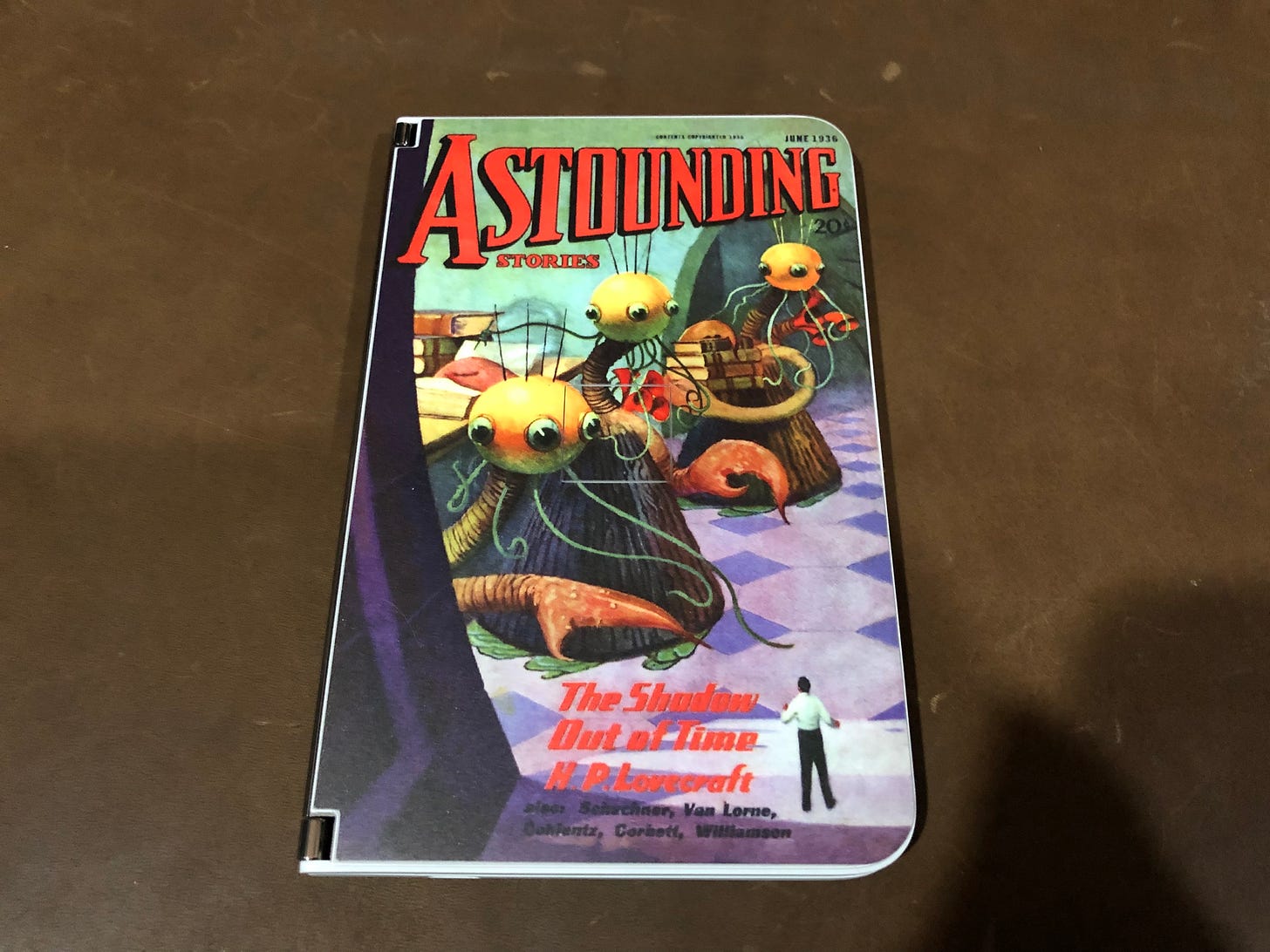
I removed the white bumpers, cleaned the device, and applied the stickers:
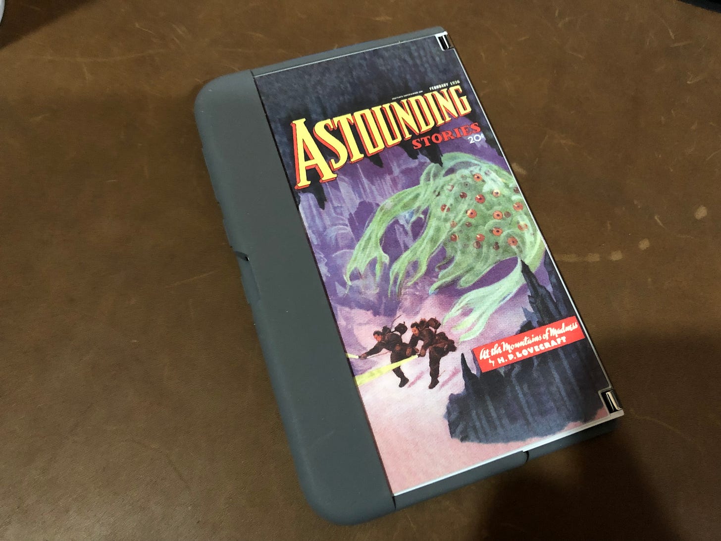
After applying the stickers, it was time to install the bumpers:
As you can tell by the images, overall it looks okay, but there’s an annoying bit of white visible between the cover and the bumper and that’s a function of the exterior cover’s slightly-raised profile from the edges. I futzed with the alignment of the decals and managed to improve the situation a bit, but the ultimate solution to this problem is to not start with a white device. Unfortunately, the current device only comes in white, so offering a black base device or other dark color may end up being a better starting point for a future repeat of this project.
Overall, the look isn’t bad and I’m planning on keeping it, even if looks very aftermarket. Unless you know what to be looking for, the device is pretty sharp and appears much less like some new-fangled gadget and more like a small notebook when I have it open and reading. The decals preserve the full functionality of the device, unlike most cases I discovered.
For the moment, I’m going to consider this a limited success, but I may revisit it if I find more white-friendly covers to use or if Microsoft releases a darker variant in the future.

